

New CN User-Interface (UI)

Entry posted by BaneofPathos
191 views
A big problem that Cybernations has is it's unappealing look. I showed the game to a teacher of mine and she commented on how overly official and bland it was -- the game came across as more of a business than an actual game. The fact is, as much as we pride ourselves as thinking there is serious business in Cybernations it still remains a game.
Therefore I have come up with some ideas for a new format for the game. These changes improve the aesthetics as well as the functionality of the game.
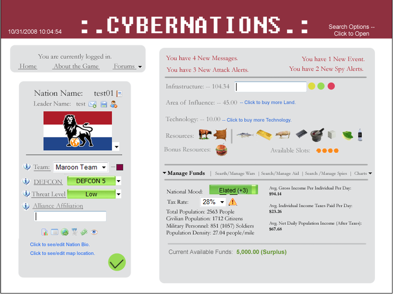
The basic premise of this new UI is to be able to manage your entire nation all from one concurrent screen.
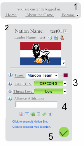
The left side displays your log in display and your nation ID card -- this allows you to edit your nation info at will. This sample only shows the ability to edit DEFCON, your flag, your notepad, Treat Level, Team, and Alliance Affiliation. But you also would be able to determine your ethnicity, currency, capital city, etc.
The log-in display at the top of the screen also allows you to cycle through different options. You can visit the forums, see the about the game screen, visit the CN Wiki, everything that you can currently do.
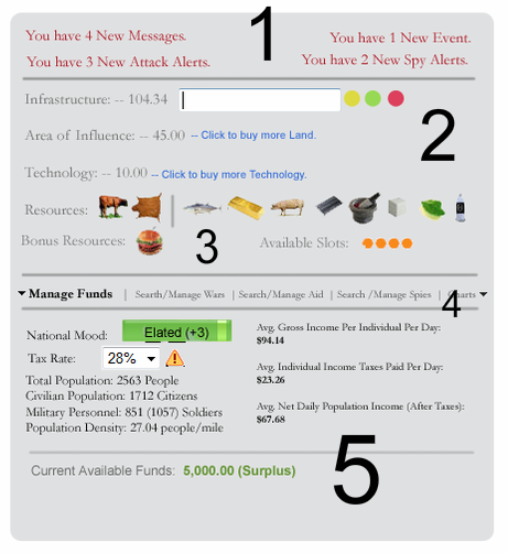
The very top-right side displays all you message info, dividing it into four sections. Beneath that is the basic management info where you can purchase tech, land, and infra.
In that little strip beneath, you can cycle through different management screens: Charts, Funds, Wars, Spies, Aid, Events, Improvements, etc. It takes the current left sided panel and places it horizontally and in a more legible, easy to flip through format.
The logo color is based on your team. If you are on the red team it's red, blue team it's blue, etc. On some of the lighter color teams the color of the text changes from white to black.
Some other notes to make also. If you highlight over a selectable item, the text will become bold and increase in size to indicate that it is selectable.
4 Comments
Recommended Comments